goal
table fit in mobile without breaking words.
table fit according to viewport.
Create a Full-width Table
table {
width: 100%;
}
relative units
For example, you can use width: 100% to make your table take up the full width of its container, or width: 50% to make it half as wide.
Use media queries
use @media (max-width: 600px) to apply a different style to your table when the screen width is less than 600 pixels,
@media only screen and (max-width: 480px) {
    /* horizontal scrollbar for tables if mobile screen */
    .tablemobile {
        overflow-x: auto;
        display: block;
    }
}
Use flexbox or grid
overflow properties
you can use overflow: scroll to add a horizontal scrollbar to your table, or overflow: hidden to clip the excess content. Alternatively, you can use overflow-wrap: break-word or word-break: break-all to break long words or lines within the table cells.
overflow-x:auto
If you’re using really wide margins, padding, borders, etc., try reducing their size (but I’m sure you thought of that).
word-wrap: break-word; Allows unbreakable words to be broken not looks good.
html {

font-size: 100%; /* 16px browser default */

}
table,td,th {
border: 1px solid var(--ast-border-color)
}
table {
border-collapse: separate;
border-spacing: 0;
border-width: 1px 0 0 1px;
margin: 0 0 1.5em;
width: 100%
}
th {
font-weight: 700
}
td,th {
padding: 8px;
border-width: 0 1px 1px 0
}
table {
margin-left: -16px;
}
table {
margin-right: 16px;
}
table {
width: 109%;
}
ul.table {
list-style-position: inside;
}
li {
margin-left: -20px;
margin-bottom: 7px;
}
table {
font-size: 0.9em;
0.9 em = 14.4 px
}
table td, table th {
padding: 9px;
line-height: 1.4;
vertical-align: top;
border: 1px solid #ccc;
margin: 5px:
}
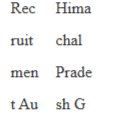
table text fit in table
CSS Syntax
word-break: normal|break-all|keep-all|break-word|initial|inherit;

1. Using word-wrap property
The word-wrap: break-word; property is used to break the long word at an appropriate break point.
Syntax
word-wrap: break-word;

i guess this is the best.
2. Using word-break Property
The word-break: break-all; property is used to break the word at any character.
Syntax
word-break: break-all;

break-all
.site-content {
/* word-wrap: break-word;

table responsive text nowrap

word-break: normal; default
https://www.w3schools.com/cssref/playdemo.php?filename=playcss_word-break

media queries specific css
| Breakpoint Setting | For Device |
| max-width 320px | Smartwatches |
| max-width 420px | Smaller devices |
| max-width 600px | Phones |
| min-width 600px | Tablets and Large Phones |
| min-width 768px | Tablets |
| min-width 992px | Laptops and Desktops |
| min-width 1200px | Monitors, Desktops |
Here is an example order for the max-width approach:
Desktop styles (not in a media query)
Tablet styles (max-width: 768px)
Mobile styles (max-width: 414px)
@media only screen and (min-width: 600px) {...}What this query really means is, “If [device width] is greater than or equal to 600px, then do {...}“
@media only screen and (max-width: 600px) {...}What this query really means is, “If [device width] is less than or equal to 600px, then do {...}.”